Banana Republic Memories from Staff Artist Kevin Sarkki

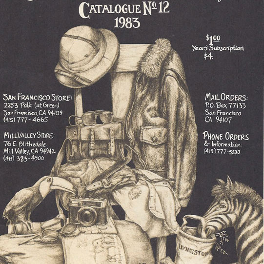
This is clearly a still life set up in the BR warehouse/studio just as Kevin describes. The bale of surplus trousers almost smells musty from here. Livingstone doesn’t seem to mind.
Scanning catalogs, as I do on an almost daily basis these days, I noticed that the Holiday 1985 Catalog credited the cover art to a a 25 year old staff artist named “Kevin Sarkki.” A quick Internet search led to an email exchange with Kevin, who was indeed a Banana Republic staff illustrator from 1982-85. In fact, he was the first artist to work for BR besides Patricia Ziegler herself! I couldn’t have been more excited and he couldn’t have been more gracious answering questions, sharing his experiences and scanning some incredibly rare early Banana Republic material.
Hired by Patricia Ziegler at a starting wage of $5 an hour, Kevin was witness to the explosive growth of a mom-and-pop operation that would soon have over a million catalog subscribers and stores across the country and world.
Kevin’s remembrances include a detailed account of how the catalogs came together-with so much hand drawn illustration rendered in printing techniques that are practically forgotten today.
Here is Kevin’s story in his own words:
After graduating from the Art Institute of Fort Lauderdale (a serious party school) I worked in the Office of Communication of Miami, FL. Moved to Atlanta, GA and drew caricatures at Six Flags Over Georgia, then to the advertising dept at the Atlanta Journal Constitution.
I came to San Francisco in February 1982. On the advisement of a friend/student at the Academy of Art I responded to an ad placed on the bulletin board there. I showed my portfolio to Patricia Ziegler, drew some clothing she had arranged, and was hired on the spot in April 1982.
It was a small operation. Officially, Mel was the writer and Patricia the artist. They also hired well-known writers to comment on the clothing and the travel lifestyle. To my knowledge I was the first art department staffer. There could have been earlier contractors unbeknownst to me, but Patricia was the primary artist before I arrived.

How awesome is this?
As far as the hired staff onsite, I knew of only a female accountant, a male stockman in the warehouse and Patricia’s mother, who managed the inventory, etc. There had to have been others working behind the scene, I just did not see them in the tight space located at 410 Bluxome, SF.
Patricia and I shared the loft space above the warehouse; that way she had a close eye on the drawings and ads I was creating. Everyone did many things: I was purchasing ad space in the New Yorker, and dealing with those supporting us in the printing trade, in addition to my illustration and design duties.
The clothing drawings from 1982-83 were mostly of me wearing the clothes and standing in front of a mirror-or setting up a still life, ex. Pith helmet.
Early on Patricia coached me on what mattered in the representation of the clothing. Her illustration style was pleasing to the eyes. I tried to maintain the soft, well-worn qualities that spoke comfort. Realize this vintage merchandise was the antithesis of the stiff department store merchandise.
The look and feel of the early catalogs was decidedly funky. After all, much of what was being sold was pure military surplus. “In Surplus We Trust” was a catchy motto that, for me, summed up what BR stood for in the early days.
People would pay to wear cast offs… a formula that was bound to profit the Zieglers. Later as they began to sell more of their original designs it became necessary to skew the aesthetic toward a more upscale market.
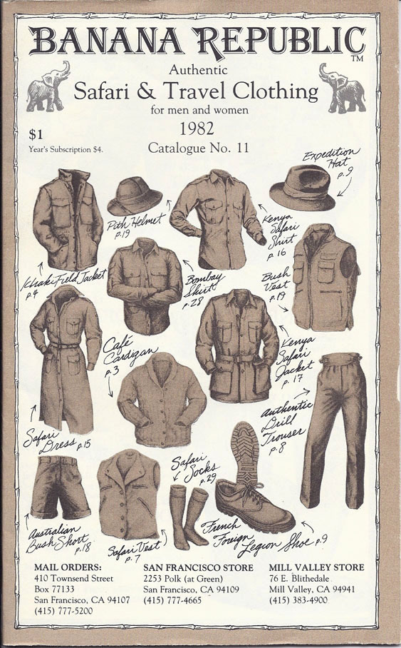
Prior to 1984 Banana Republic Catalogs were duotones. The two-color product illustrations were pencil drawings, applied to the mechanical boards as halftone screened camera-ready art, with the second color defined by cutting a mask on rubylith or parapaque on an acetate overlay. So the whole catalog was printed as black and a Pantone color. This was a super low budget operation-I was paid between $5 and $8.50 per hour. During my lunch break I’d walk the drawings over the photostat business to have print-ready screened images made.
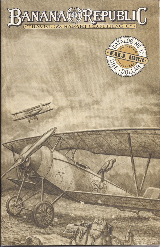
Catalog 15 features a beautiful pencil illustration of the Banana Republic Army Air Corps plane, the first appearance of this iconic BR symbol that would find it’s way to many a catalog cover and become a gift box as well.
The Gap transition in 1983 was loud and swift. Gap leader Donald Fisher, Mel, Patricia, and others entered the room near my drafting table. Tensions were high as the walls vibrated to the sound of heated negotiations. Soon the tone of the office shifted from a family-run to a corporate-owned operation.
The Gap brought in a huge cash infusion.
The catalogs shifted to full-color and the pencil drawings were reproduced by an outside repro service onto a paper that had a “tooth” similar to watercolor paper, then color was introduced using Dr. Martin dyes, etc.

This is the last duo-tone catalog before they went to color. It features Kevin Sarkki’s wonderful illustration of an African Bush train delivering the comforts of home for the holidays.
Later, watercolor pencils were used.
Business growth required a move down the block to a much larger space. The second art department staffer was brought in from the San Francisco Newspaper Agency. Mel Ziegler had worked for the paper prior to forming BR. The guy was much older and experienced than I so he became the senior art dept staffer-though he did not draw the clothing. Later, Rob Stein became the second staff illustrator.
They retained the services of internationally acclaimed designer Primo Angeli to create a logo/masthead for all ephemera. The earliest appearance I am aware of is the Summer 1983 catalog cover.
The Gap stores demanded an upscale, urban look and feel-slicker and slicker-until the original concept of anti-fashion was superseded by fashion. Scores of talent from all quarters were clamoring to have their portfolios reviewed for inclusion. The office became unbearably political.
I never worked on the store design. However, one day Patricia sent me to the Hillsdale Mall with the intention of painting a mural in the soon-to-open-store. I was repelled by a team of interior designers who were hostile towards me.
I was beginning to feel helpless under the crush of the Gap’s industrial-military complex (pardon the analogy). Gone were those days of me toiling beside musty old sacks of surplus clothing under the spell of Patricia. By that time I rarely saw Mel & Patricia. While I am sure they had at least ceremonial creative control, there was plenty of pressure from the legions of hired guns to do things the Gap way. The department expanded quickly with specialists controlling every aspect. I recall an upper management bean counter, one of D. Fisher’s sons, hovering over my drawing board. After watching me work on a stipple drawing (a technique also known as pointillism) he asked me, “How many dots is that?” Then he laughed and walked away.
Only 3-1/2 years at BR and I’d had enough and resigned.
————————————————————————————
I’m tremendously grateful to Kevin for sharing his catalogs and memories and for the contributions he made towards the Banana Republic we all remember so fondly.
Below is the 1985 Holiday Catalog (No. 26), which was the last cover Kevin did before leaving Banana Republic. It is a collage illustration that mixes Banana Republic employees with historical adventure personalities and other found images. As it was his final piece, it was of great significance to him, and he says “I was very humbled to have been chosen to portray my BR colleagues in their favorite theme.”
For a key to identifying the faces on the cover, click here. If you are a BR fan please leave a comment below, we’d love to hear your memories and thoughts.
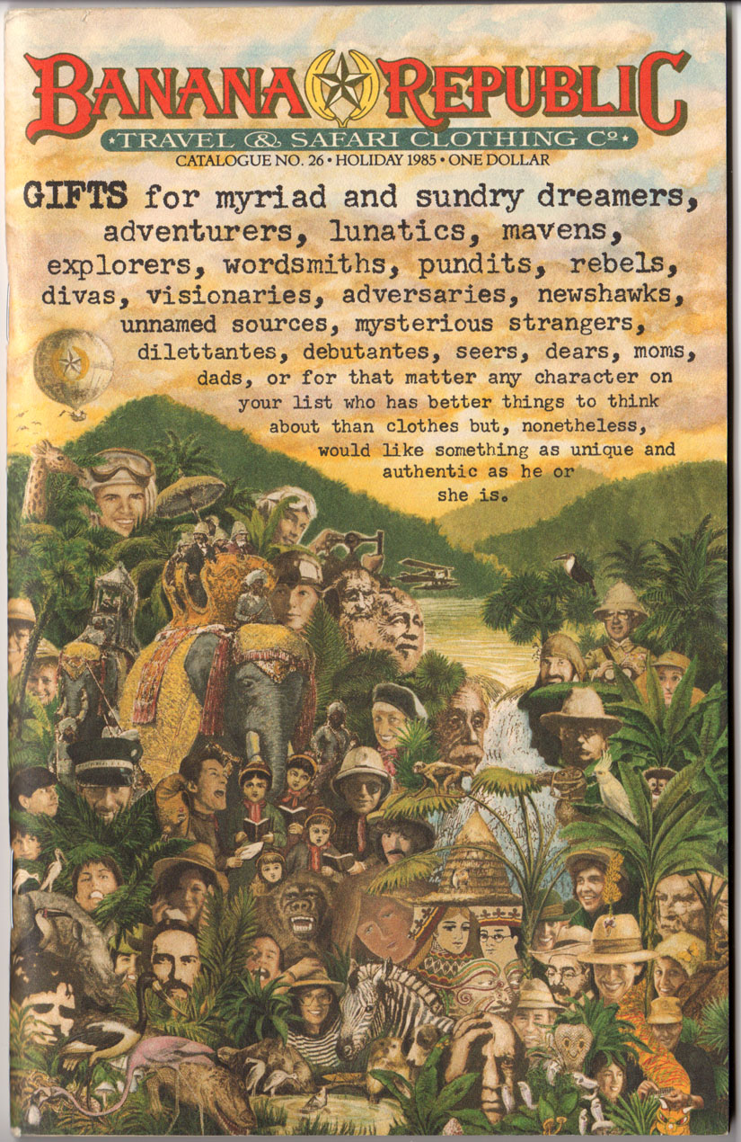
The 1985 BR Holiday Catalog (No. 26), Kevin Sarkki’s final catalog cover before he left BR.


