Banana Republic Memories: Mike Madrid, Production Artist, Part 1
Several months ago I sent a note to Ward Shumaker, the San-Francisco-based illustrator who did a lot of work for Banana Republic in the catalog days. He in turn put me in contact with catalog Production Artist, Mike Madrid. Mike got his start at Banana, and stayed on through the end of the catalog era, and beyond—with a long career as an art director at Gap and Old Navy.
Mike generously offered to answer all of my most geeky questions and has been a treasure trove of information and material. I’m pleased to share with you his behind-the-scenes story of the Banana Republic Catalog in his own words, compiled from our email and telephone interviews.
The Early Days at BR
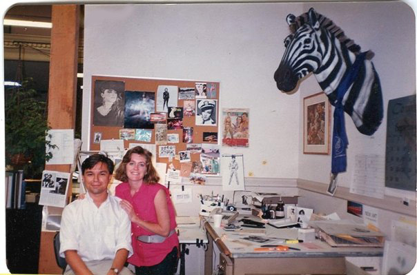
Production Artist Mike Madrid poses with darkroom manager Randy Parsons at his desk at Banana Republic’s Bluxhome Street offices in the mid-1980’s. Livingstone the zebra (fake, of course), wearing a blue aviator’s scarf, keeps an eye on things from above.
I got a freelance job as a production artist at Banana Republic right after I graduated from college. I finished school at the end of my fall semester in 1983, and I literally started work that first week of January. I had shopped at the BR store on Polk Street, so I thought it was a cool gig. I remember they had five stores at the time, because I had to do the different versions of the little banner that ran on the top corner of the cover.
It was a really bare-bones operation. Kevin Sarkki and Rob Stein were still on staff at the time, and they mainly did the product illustrations for the catalogs. Rob had started doing some of the cover illustrations by the time I had started.
We were on Townsend Street over by Caltrain for a little while and then within three or four months we moved into a space on Bluxome Street that housed the old headquarters for Victoria’s Secret. In the teens and 20s it had been a slaughterhouse; we were told the floors tilted slightly because the blood had to drain off.
In 1987 the inspectors insisted we move out of the building immediately; it was a big old brick building, not at all safe. Sadly, it ended up falling down in the 1989 Loma Prieta Earthquake and some people outside were killed. (Photos and information of the Bluxome street collapse. Another photo here)
Gap had bought BR (in 1983) about a year and a half before I started, which is one of the reasons that made it pretty appealing to me to work there. I know a lot of people have this idea that Gap ruined it (BR) but in the beginning Gap had a hands-off policy with certain aspects of the company. They brought in a lot of the infrastructure to do a lot of the stuff like the accounting, the fulfillment for the catalog and the phone bank, that kind of stuff. They were very “hands off “ with the creative and the catalog… that was really Mel and Patricia’s thing. And I think to some degree the product was really her thing. As they started getting away from the surplus and started to really make new product, Gap brought some merchandise people to work with her to develop the lines and as there got to be more stores, to bring in different ideas of what you need to fill a store.

Catalog 19 for Summer 1984 was the first travel journal themed issue and introduced some more sophisticated product illustrations including the first “wardrobe” page seen here.
Each season we would usually do an initial catalog that would have one of the Zieglers’ travel journals as the theme. So you’d have one big deadline, and then a little bit of downtime. Then we would do an “update” version of the same catalog with the same content but a new cover and perhaps a page or two of new merchandise.
Eventually we started to create new editorial themes for the ‘update’ issues like “What to Wear Where,” and refresh more of the product inside. So it got to the point where we constantly had something in the works, and the pace became more hectic.

The Zieglers pose at the Bluxome street offices in a 1985 photo from a San Francisco Examiner magazine article.
The Zieglers provided overall creative direction. Mel managed the editorial content and Patricia oversaw the illustration and design. As Mel got more involved in the business side and Patricia focused more on the clothing design, they became less involved with the catalog on a daily basis. They were also traveling quite a bit to the locations that would provide the themes for the catalogs. Mel would write his travel journals and Patricia would do the illustrations. She would also be developing the merchandise that would tie-in with those location-specific travel themes—Africa, Britain, etc.
Then there were the ‘editorial’ illustrations. Those would be for the covers and for the theme of each catalog. When Terry Stelling was there, that was more his area, while he had me manage the product illustrations.
We used a variety of Bay Area artists. We were coming from a pretty specific sensibility, so their work had to fit within that. Patricia Ziegler had been the original artist, so everything that followed had to be an evolution of that style. There was an emphasis on everything looking hand-drawn, as though it was from a traveler’s sketchbook.
We were also going for a New Yorker magazine kind of feel in terms of being smart and witty. Then we were trying to maintain an updated British Empire sensibility/1930s travel magazine feeling with the design of the catalog. So those were the parameters that the illustrators worked within.
We always knew things were not right if the work looked TOO slick.

