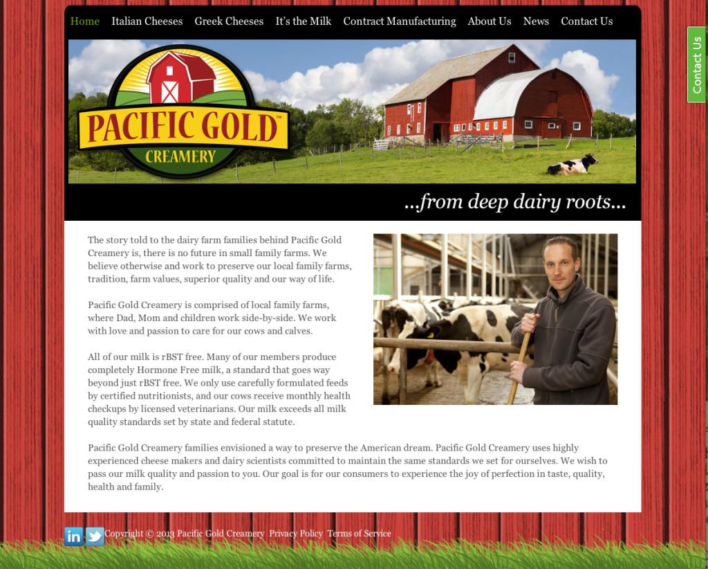
I’ve recently partnered with The Food Connector, a food industry marketing company. Our latest project is for the Pacific Gold Creamery, a new cheese producer that needed branding and marketing from the ground up. The team at Food Connector had already named the company and had a logo, but they needed a website and branding for two lines of cheese the company would be producing.
It was a great opportunity to use illustration in the logo as both names needed some visual support to convey their meaning.

For Artemis Feta Cheese, a drawing of the Goddess of the Hunt was a natural, and a portrait with arrows in a quiver was more readable than a full figure shooting a bow and arrow as is traditional.
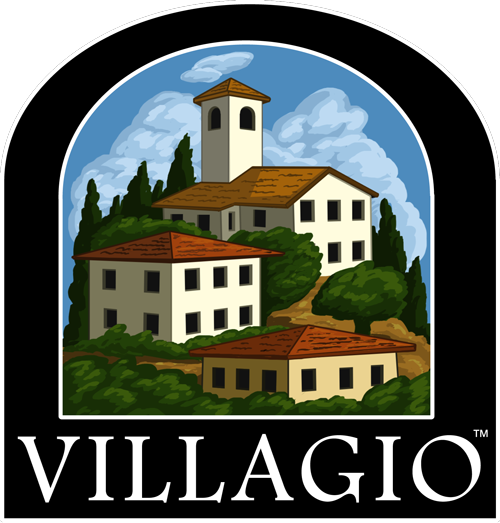
For the Villagio italian cheese brand, a bold graphic illustration of a hillside village is meant to have an old world flavor with a more modern sensibility than a solution using renaissance clip-art would provide.
Another neat project for The Food Connector involved this postcard a food distributor targeting the casino industry. Originally TFC wanted to use some casino-related stock imagery to accompany the tagline. I made the case that an illustration that incorporated the specific services Axis provides would create a more informative eye-catching piece of marketing. This illustration was created very quickly, entirely in Photoshop.

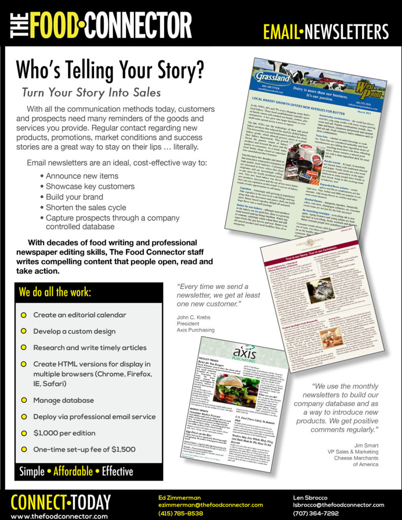
I’ve also provided TFC with layout services for newsletters and sell sheets.


